In brief, The anatomy of an effective website for AI Overview and human users consists of:
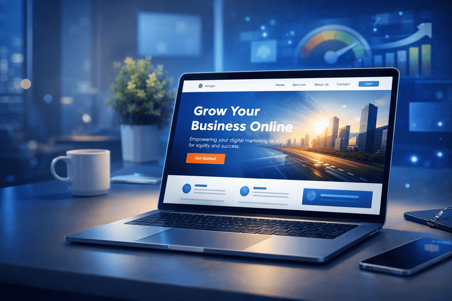
- Clear Headlines: Answering “What do you offer?” in seconds.
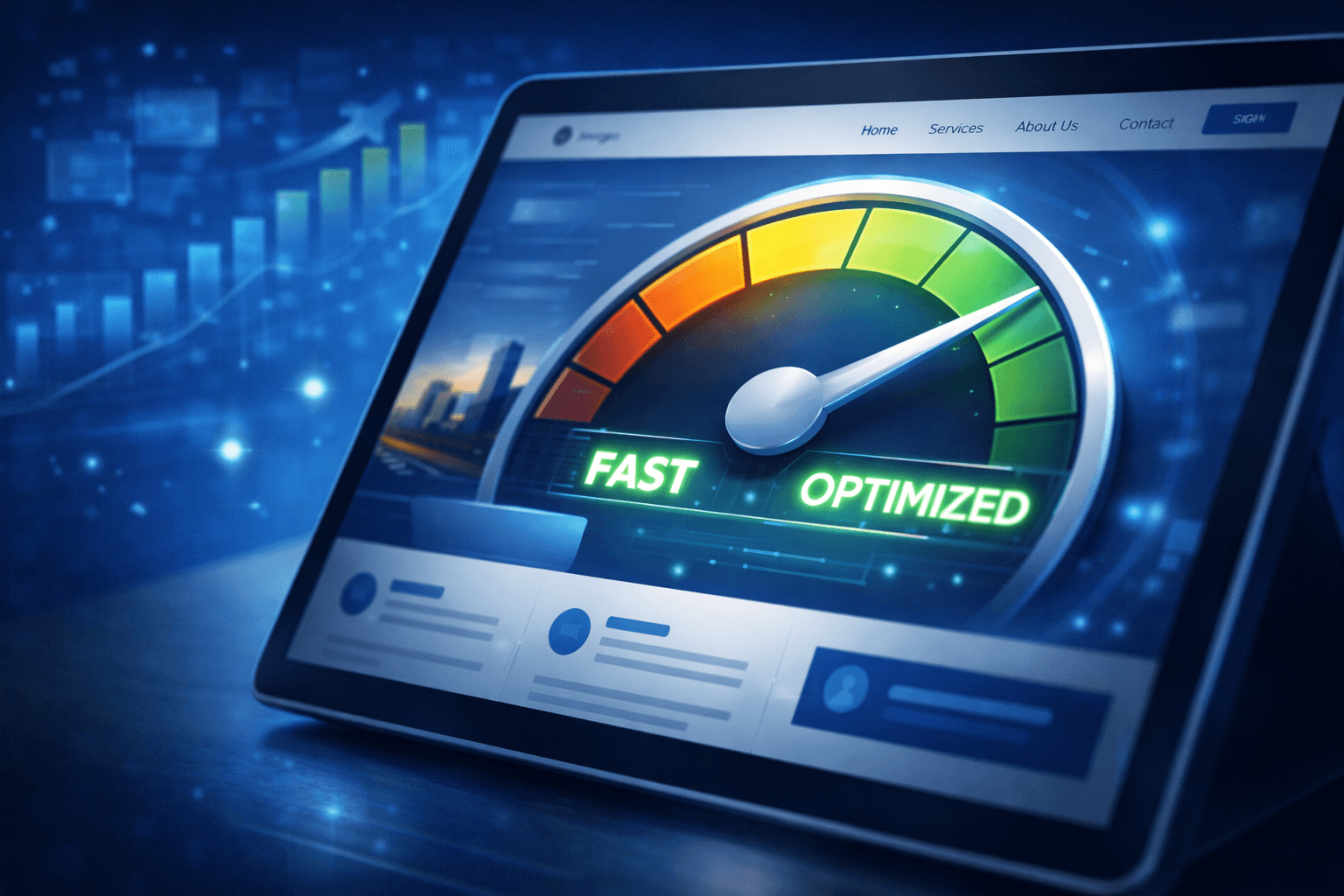
- Optimal Load Speed: Ideally below 2 seconds to prevent bounce rate high.
- Relevant Hero Image: High-quality visuals that represent solutions to users.
- Call-to-Action (CTA) that stands out: Action buttons are clear and easy to find.
- Social Proof: Trust elements such as client logos or short testimonials.
Understand “Rule 3 Second”: Why First Impressions Are Everything?
In today's attention economy, time is the most valuable currency. As a digital practitioner for more than a decade, we're in Sociodreams saw a significant shift in consumer behavior. No more visitors “read” website; them “scan” (scanning).
When someone clicks on your link, their brains subconsciously perform a quick evaluation: Is this site safe? Does this answer my problem? Does this look professional? If in 3 seconds they didn't find the answer, they'll hit the back button and move on to a competitor. This is what is called bounce rate which is caused by a failure of visual anatomy.
Psychological Impact on Business Decisions
The decision to purchase or collaborate often begins at an emotional level of trust. Messy website, slow, or confusing sends signals that your business may not be managed well. On the contrary, A clean and structured website reflects professionalism and readiness to serve customers.
Vital Components in the Area “Above the Fold”
Area Above the Fold is the part of the website that first appears on the screen without having to do anything scrolling. This is “most valuable land” in the digital world.
1. Headlines that Explain the Solution, Not a Feature
A common mistake we often encounter is headlines that are too poetic or abstract. Visitors need clarity.
- Bad: “We Are The Best in This Industry.”
- Good: “Increase Your Sales Through Data-Driven Digital Marketing Strategies.”
2. Sub-Headlines That Give Context
If the headline is a big promise, then the sub-headline is a brief explanation of how the promise was fulfilled. Use 1-2 sentences to reinforce the reasons why visitors should care.
3. Primary Call-to-Action (CTA)
Don't leave visitors guessing what they should do next. CTA buttons should have a color that contrasts with the background and use active verbs such as “Free Consultation”, “Try Now”, or “Get a Quote”.
Navigation and User Experience (UX): Eliminate Conversion Barriers
After passing 3 first second, your website's job is to guide visitors towards seamless conversion (frictionless).
Logical Visual Hierarchy
The human eye tends to move in patterns F or Z while reading the screen. Place the logo at the top left, simple navigation menu on the right, and main content in the middle is a time-tested best practice.
Mobile Speed and Responsiveness
Along with the algorithm Mobile-First Indexing from Google, website performance on mobile devices is no longer an option, but rather a necessity. Websites that are unresponsive or slow to load on mobile phones will be immediately abandoned, regardless of how good the design is.
Common Mistakes That Kill Conversions
Based on our experience in auditing hundreds of digital assets, here are some “conversion killer” which business owners often don't realize:
- Too Many Choices: Providing too many buttons or links on the main page actually triggers decision paralysis (analysis paralysis).
- Autoplay Video with Sound: This greatly disrupts the user's experience and often makes them immediately close the browser tab.
- Too Long Form: Asking for too much information up front can drastically reduce a potential prospect's interest.
- Lack of Contact Clarity: A visitor's inability to find a phone number or email address within a short period of time can damage a business's credibility.
Strategic Insights: Website Trends in the Era of AI and Personalization
The digital world continues to evolve. In year 2026, websites are no longer just static brochures, but rather a dynamic entity.
- Micro-Interactions: Smooth animations when the user performs certain actions provide instant feedback and a modern feel.
- Accessibility (Accessibility): Ensure the website is accessible to everyone, including those with sensory disabilities, has now become a global standard for big brands.
- Hyper-Personalization: Show different content based on a visitor's location or previous search behavior to increase relevance.
We're in Sociodreams believes that integration between visual aesthetics and technical sophistication is the main key to winning the competition in the increasingly competitive Indonesian market.
Anatomy of a High Converting Website Check-list
To ensure your website is ready to compete, use the following checklist:
- [ ] Does the page load in less than 2 second?
- [ ] Is the value proposition obvious without having to scrolling?
- [ ] Is the menu navigation easy to understand in 5 second?
- [ ] Is there an element of trust building (testimonial, logo partner, certification)?
- [ ] Does the website look and function perfectly on mobile devices??
- [ ] Is there only one main message (CTA) the dominant one?
Conclusion: Invest in First Impressions
The right website anatomy is not just about beautiful design, but rather about psychology, speed, and clarity of communication. Win the attention of visitors inside 3 The first second is a crucial first step. If you fail at this level, all the marketing efforts and traffic you bring will be wasted.
A high-converting website is a working digital asset 24/7 for your business. Ensuring every element—from headlines to server speed—is at peak performance is a long-term investment that will pay off (ROI) the real one.
Every business has unique characteristics, and your website should reflect those strengths instantly. If you feel that your current website is not providing maximum results or want to ensure your digital performance is ready to face future challenges, let's discuss further with Sociodreams to find the right strategic solution for your brand.